
The Real Reason Your Website Isn't Converting (Hint: It's Not Your Design)
You've heard it a hundred times: "Your website needs to convert." And you're nodding along, thinking, yes, I know, that's the whole point. So you hire someone. Or you rebuild it yourself. You pour time and money into making it beautiful, clear, and professional.
And it still doesn't convert.
So what's going on?
Here's the uncomfortable truth: conversion is not primarily a design problem. It's a clarity problem. And clarity isn't something a designer can fully hand you. It has to come from inside the business first.
What "Converting" Actually Means
Before we talk about why it's not happening, let's be specific about what conversion actually means. For most service-based businesses, conversion doesn't just mean someone clicking "book now." It means:
A stranger understands what you do within seconds of landing on your site. They recognize themselves in your language. They believe you can help them. They trust you enough to reach out.
That's four things that all have to happen before anyone fills out a contact form. And all four of them depend on clarity, not color palettes.
The Three Clarity Gaps I See Most Often
Gap 1: Who it's for is too broad.
"I help entrepreneurs grow their business" sounds like it should be inclusive. But vague positioning means everyone sees themselves as maybe a fit, which means no one feels certain. Specificity creates confidence. When someone reads your site and thinks "that's exactly me," they convert.
Gap 2: The transformation isn't stated plainly.
Most service providers describe what they do. Very few describe what changes for the client. There's a difference between "I design Squarespace websites" and "I turn your cluttered, outdated site into a digital HQ that actually represents your brand and sends the right message to the right people." One is a task. The other is a promise.
Gap 3: The path forward is unclear.
Someone lands on your site, likes what they see, is interested, and then what? If there are three different "start here" buttons pointing to three different things, they'll make the easiest decision: none.
The mistake isn't bad design. The mistake is putting multiple entry points in front of someone who's already convinced.
Why Good Design Can't Fix This
A talented designer can turn your confusion into something beautiful. They can create a visual hierarchy, clean layouts, and an elevated color palette. But they cannot make you clearer. That has to come from you.
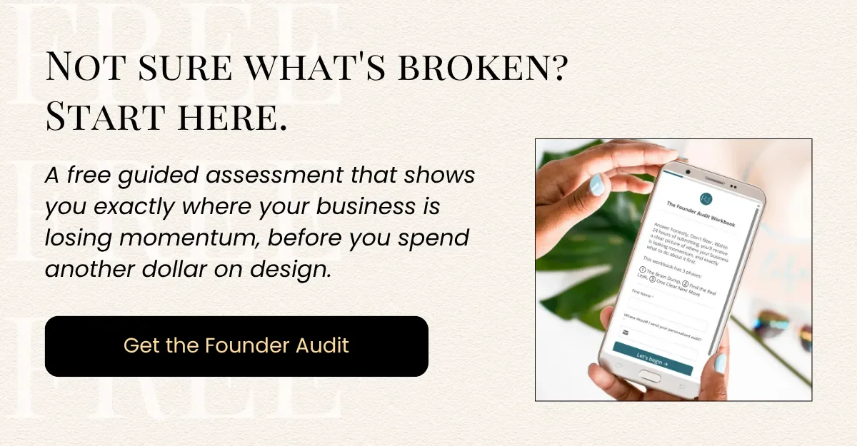
This is why I built The Founder Audit, a self-guided workbook that walks you through the questions that surface your clarity gaps before you ever touch your website. Things like: what do you actually want your site to do? What's the one thing you want a visitor to do? Is your offer structured in a way that makes sense from the outside?
You'd be surprised how many founders can't answer those questions without some structure. Not because they don't know their business, they do. But because they're too close to it to see it clearly.
What to Do Before Your Next Website Update
Before you change your homepage again or hire someone to redesign your site, answer these:
Can you describe what you do in one sentence that a non-industry person would understand?
Does your site speak to the specific fear or frustration your ideal client is feeling right now?
Is there one clear, obvious next step for someone who's ready?
If you're uncertain on any of those, start there. Get clear on what you're trying to say before you invest in how it looks.
The Founder Audit is designed for exactly this moment. When you know something isn't working, but you're not sure where the disconnect is. It walks you through a structured self-assessment so you can see your site and your business through your client's eyes.
Because the website isn't the problem. The clarity is. And clarity is fixable, if you know where to look.