
The Difference Between a Pretty Website and a Working One
I want to settle something that comes up constantly in conversations about websites: looking good and working well are not the same thing.
A website can be visually stunning and functionally useless. It can also be relatively simple and remarkably effective. The goal: the thing worth investing in is both. But when they conflict, function wins. Every time.
Here's how to tell which one you have.
A Pretty Website...
Prioritizes visual impact over user journey. The design makes a strong first impression, but navigating from interest to action isn't intuitive.
Uses beautiful images that don't communicate anything specific. Stock photos of laptops and coffee cups look polished. They don't tell a visitor who you are or what you do.
Has strong aesthetics and weak hierarchy. Every section competes for attention. Nothing clearly says: start here.
Feels impressive to the founder and confusing to the visitor. This is the most common version. The person who built it knows exactly what everything means. Their potential clients don't.
A Working Website...
Leads with the visitor's problem, not the founder's solution. It starts with "you're here because..." before it gets to "here's what I do."
Has one clear conversion path. Not five. One. The design supports that path by making it obvious.
Uses plain language. Not jargon. Not industry-insider shorthand. Plain, direct language that someone outside your field would immediately understand.
Makes the next step feel low-stakes and easy. The contact form isn't a commitment. The discovery call isn't a sales pitch. The language around those actions reflects that.
Feels like a conversation. It has a point of view. A personality. A reason to stay.
The Sweet Spot
The sites that actually move the needle, the ones that get inquiries, book calls, and build trust, have both. The design elevates the experience. The structure does the work.
That's what I build.
Custom Squarespace web design at Refresh Design Studios isn't a template drop-and-handoff. It's a process: we start with your business logic, map the client journey, and build a site that serves both your brand and your potential clients.
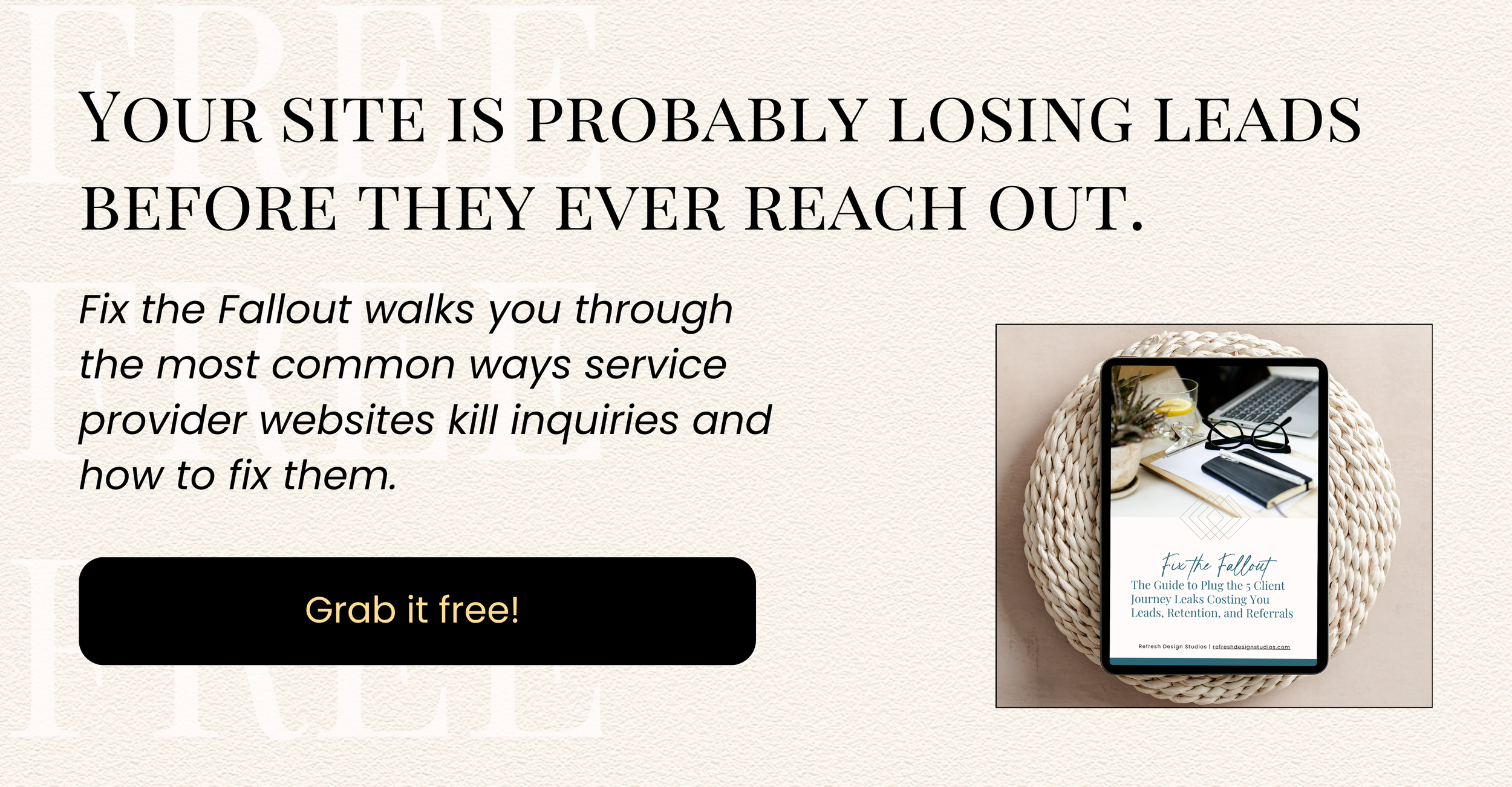
If you're not sure your current site is doing either of those things, start with Fix the Fallout. A free resource that walks you through the most common ways service provider websites lose inquiries before they ever start.
Pretty is nice. Working is necessary. Let's aim for both.